Carnival is the celebration in which the explosion of color takes over in playful disguises and unconventional colors, able to amaze young and old.
In home furnishings, however, the “harlequin” effect is certainly not what interior designers are looking for. So how do you choose the right colors and get the perfect match? Find out with our guide!
THE 3-COLOR RULE FOR THE PERFECT MATCH
Do we all remember the chromatic scale of colors, made up of primary colors, secondary colors and tertiary colors?
The primary colors are magenta, yellow and cyan blue and are the starting point for the realization of all other colors. In fact, the secondary colors derive from the mixing of the Primaries, while the tertiary colors are obtained from the union of Primary and Secondary colors in different parts.
In interior decoration there is the “3 Color Rule”, which helps to choose the right colors to obtain a perfectly balanced interior.
– Base color: should be a neutral, but warm color. It materializes in the base color of your furniture, and is the one that is chosen for floors, walls, curtains or window frames. These components should all have the same color, or similar shades of the same palette.
– Intense Color: generally chosen in a shade darker or brighter than that of the Base Color, it is intended for a few structural pieces, such as a wall, or furniture, such as a sofa or shelving.
– Break Color: the third color is a break from the monotony deriving from the use of only two shades. This color is to be reserved for some elements that are not central to the furniture, such as ornaments or small pieces of furniture. This must be a neutral color – such as gray, taupe, brown, indigo, champagne, white or black.
THE BEST COMBINATIONS WITH STAINLESS STEEL
The choice to use stainless steel in interior design proves to be a winner for two main reasons.
The first derives from the intrinsic properties of the material, such as ease of cleaning, durability or resistance to fire and corrosion that make stainless steel the perfect choice for both the kitchen area and the bathroom.
The second reason is highlighted in the fact that steel enriches and embellishes the environment, making each environment that welcomes it unique and contemporary.
In the kitchen, combine a stainless steel worktop by COMPONENDO with warm colors such as brown, burgundy or navy blue if you want to achieve a warm and welcoming atmosphere. If, on the other hand, you want a vibrant and bright atmosphere, you can choose a lighter color scale, such as mocha, taupe, light gray or cream.
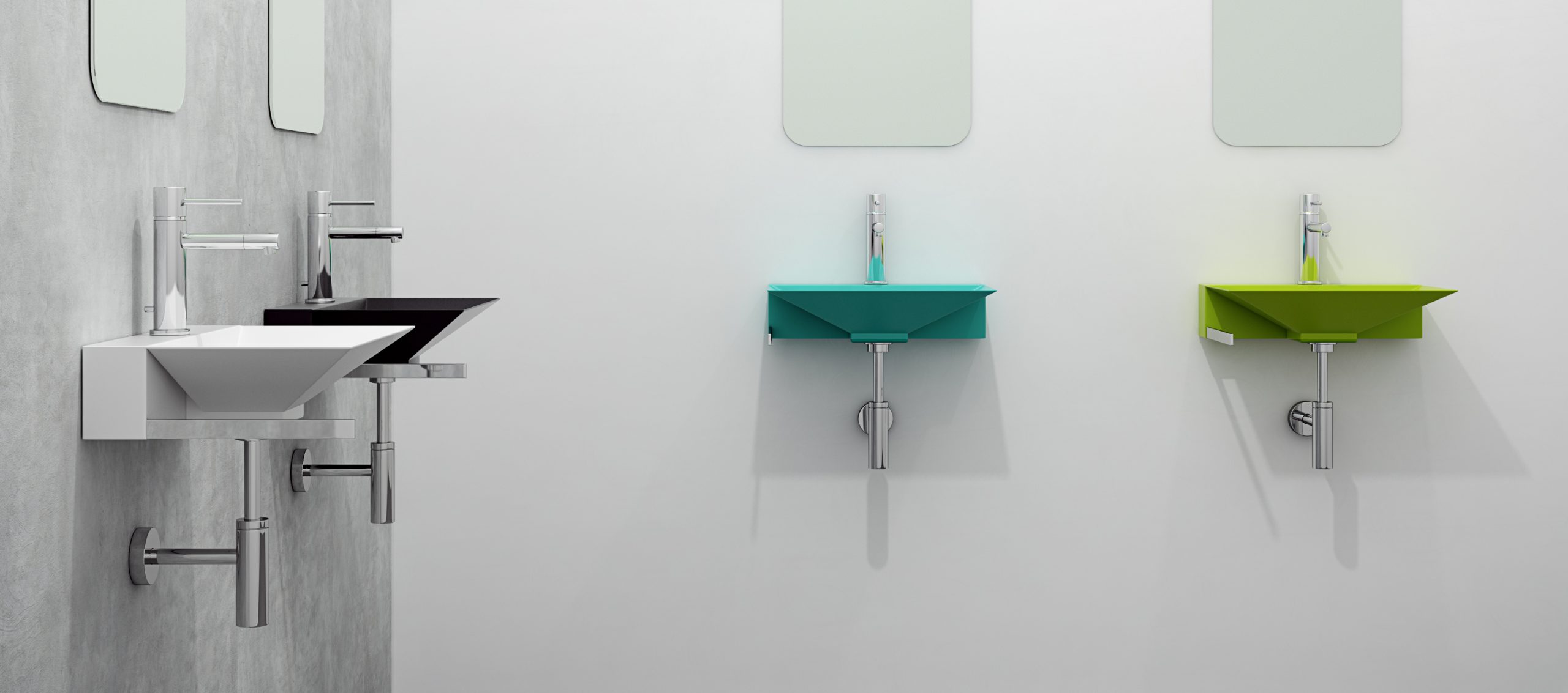
In the bathroom, on the other hand, you can combine furnishing elements by composing with light colors such as lavender or pastel pink for a romantic and classy touch, or with darker colors such as gray or forest green for a more avant-garde atmosphere.
THREE PROPOSALS OF COLOR PALETTE FOR YOUR HOME
If you have chosen the brilliance of Componendo stainless steel to furnish your home, you are undoubtedly looking for a chromatic combination that fully enhances the beauty of the material. So here are three proposals for a color palette to make your new Componendo furnishing accessory stand out to the maximum.
IF YOU ARE PASSIONATE OF MODERN-CHIC
Blue colors are very trendy for kitchens because they add depth and dimension to the room, playing well with white and other neutral tones. To make your stainless steel shine, you can paint a wall or kitchen cabinets a beautiful navy blue. You can also add touches of burnt earth color to items like high chairs, complementing it with a warm hardwood floor.
IF YOU LOVE THE GREEK STYLE
The choice of inserting a tile tiling that recalls the colors of Greece, mixed with gray-blue and white tones, will ensure a Mediterranean and comfortable touch to your kitchen or bathroom. Accompanying them with stainless steel, the result will be very bright and avant-garde.
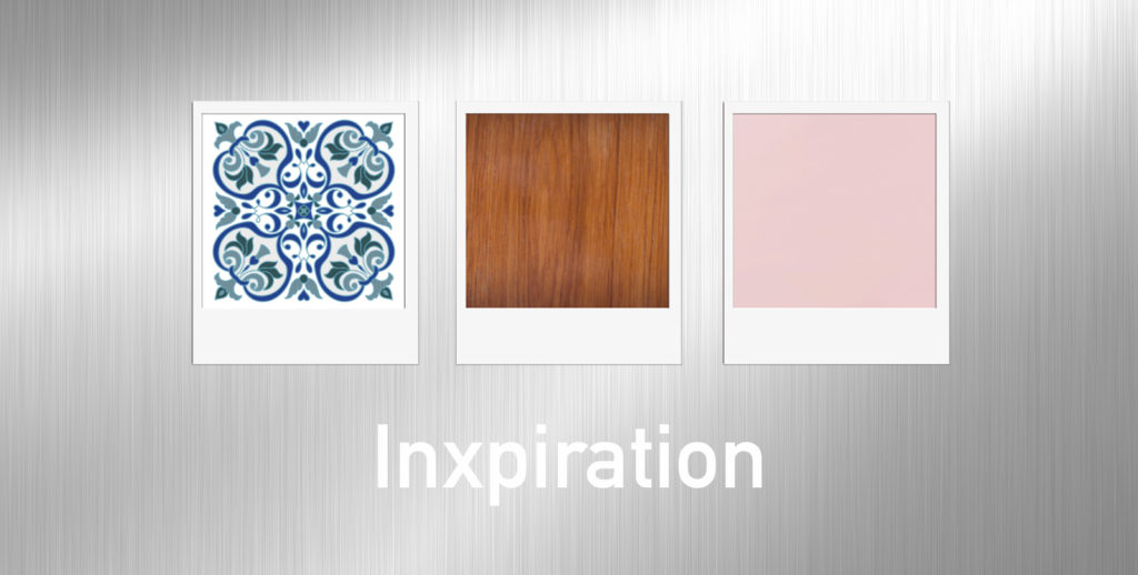
IF YOU LOVE PASTEL COLORS
When you thinks about pastel colors, you don’t normally believe that they are able to give character to the environment in which they are inserted. The question changes, however, if you imagine them inserted in a lively context such as the kitchen, where stainless steel blends perfectly with the dark parquet and a pastel green wall. For a peaceful yet impactful atmosphere.